To choose the best window treatment colors, start with your room’s existing palette (walls, flooring, furniture), decide whether you want a matching look for continuity or a contrasting look for visual interest, and test samples under natural light at different times of day. Neutral tones like white, beige, and soft gray are the most versatile and forgiving choices.
Selecting window treatment colors is one of the most impactful design decisions in a room, because shutters, blinds, shades, and drapery occupy a large share of the visual space. You do not need a design degree to get it right. A few practical guidelines will help you pick colors that complement your home and still look beautiful years from now.
Key Takeaways
- Evaluate your existing palette first: walls, flooring, furniture, rugs, and lighting.
- Matching colors creates continuity and makes rooms feel larger; contrasting colors add depth and personality.
- Always test samples under morning, midday, and evening light before deciding.
- Neutrals (white, beige, greige, soft gray) are the most versatile and adapt to future décor changes.
- Material changes how a color looks, so review samples on the actual product.
Why Do Window Treatment Colors Matter?
Window treatment colors matter because they fill a large portion of a room’s visual space and directly shape its overall look and mood. The right color can make a room feel larger, add warmth, improve how natural light spreads, highlight architectural features, and tie a design together.
The wrong color does the opposite: it feels disconnected from the rest of the room and disrupts visual flow. That is why color selection deserves the same attention you give to furniture, flooring, and paint.
How Do You Start Choosing Window Treatment Colors?
Start by evaluating the room you already have before looking at any samples. Your window treatments should either complement or intentionally contrast with what is already there.
Look at:
- Wall colors
- Flooring materials
- Furniture finishes
- Area rugs
- Decorative accents
- Natural lighting conditions
For example, a room with neutral walls and natural wood flooring often pairs well with warm white shutters or soft beige shades. In open floor plans, common in homes across North Carolina and South Carolina, color consistency between connected spaces matters even more.
Should Window Treatments Match or Contrast With Wall Colors?
Window treatments do not have to match your walls. Both matching and contrasting work well; the right choice depends on the atmosphere you want.
Matching colors creates a seamless, continuous look. Benefits include:
- Makes smaller rooms feel larger
- Creates visual continuity
- Supports minimalist designs
- Let’s furniture and décor stand out
Contrasting colors create interest and depth. Benefits include:
- Highlights windows as architectural features
- Adds personality
- Makes a stronger design statement
- Works well in modern interiors
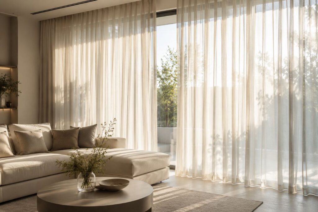
How Does Natural Light Affect Window Treatment Colors?
Natural light significantly changes how colors appear throughout the day. Bright, sunny rooms make colors look warmer and lighter, while rooms with limited light can make the same color seem darker or cooler.
Before finalizing a color:
- View samples in morning light
- Check them at midday
- Evaluate them in evening light
- Compare how they look under artificial versus natural light
This single step prevents most post-installation surprises.
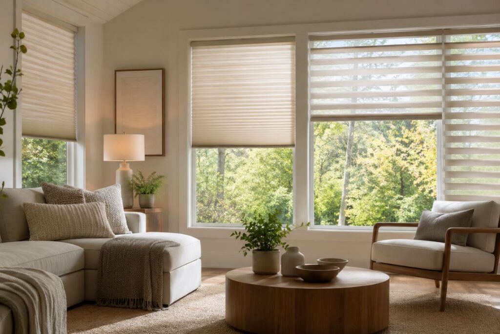
What Are the Most Popular Window Treatment Colors?
Neutral colors are the most popular and requested options because they are versatile and timeless. The most common choices are white, off-white, cream, beige, greige, light gray, and soft taupe.
Neutrals adapt easily as décor changes over time. At Carolina Shutter & Blinds, many homeowners choose neutral colors specifically because they stay flexible when furniture, paint, or accessories are updated later.
When Do Bold Colors Make Sense?
Bold colors work when you want a deliberate focal point or a more personalized look. Consider deeper shades if you want to create a focal point, if the room lacks architectural character, if your décor already embraces color, or if you prefer a distinctive style.
Popular bold options include navy blue, forest green, charcoal gray, rich brown, and black accents. The key is balance, so the treatments complement the room rather than overwhelm it.
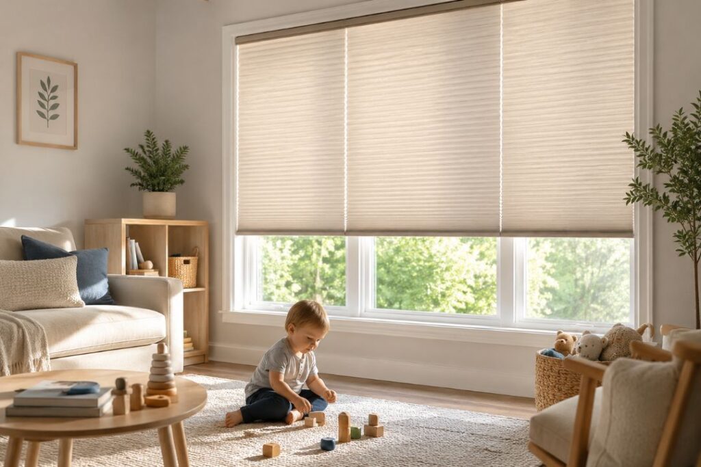
What Are the Best Window Treatment Colors for Each Room?
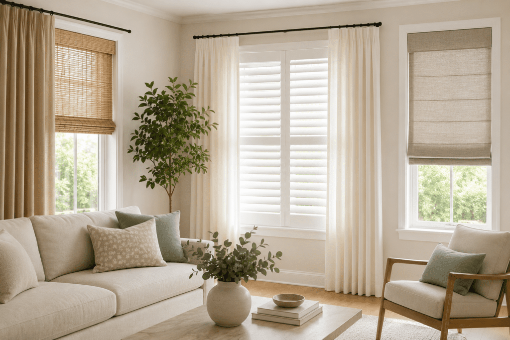
Different rooms call for different approaches. The table below summarizes reliable color choices for each room and the effects they create.
| Room | Recommended Colors | Effect |
| Living room | Soft white, warm beige, light gray, neutral wood | Comfortable, flexible, adapts to seasonal décor |
| Bedroom | Soft gray, warm cream, muted blue, light taupe | Calming and restful while staying elegant |
| Kitchen | White, light gray, soft beige, natural wood | Clean, bright, and inviting |
| Home office | Neutral shades with subtle character | Reduces distraction, stays welcoming and productive |
How Do You Coordinate Colors Across an Open Floor Plan?
In open floor plans, colors across connected spaces should coordinate rather than match exactly. You can keep each room’s personality while maintaining a cohesive whole.
Helpful strategies include:
- Using similar undertones
- Staying within the same color family
- Repeating materials across spaces
- Maintaining consistent finishes
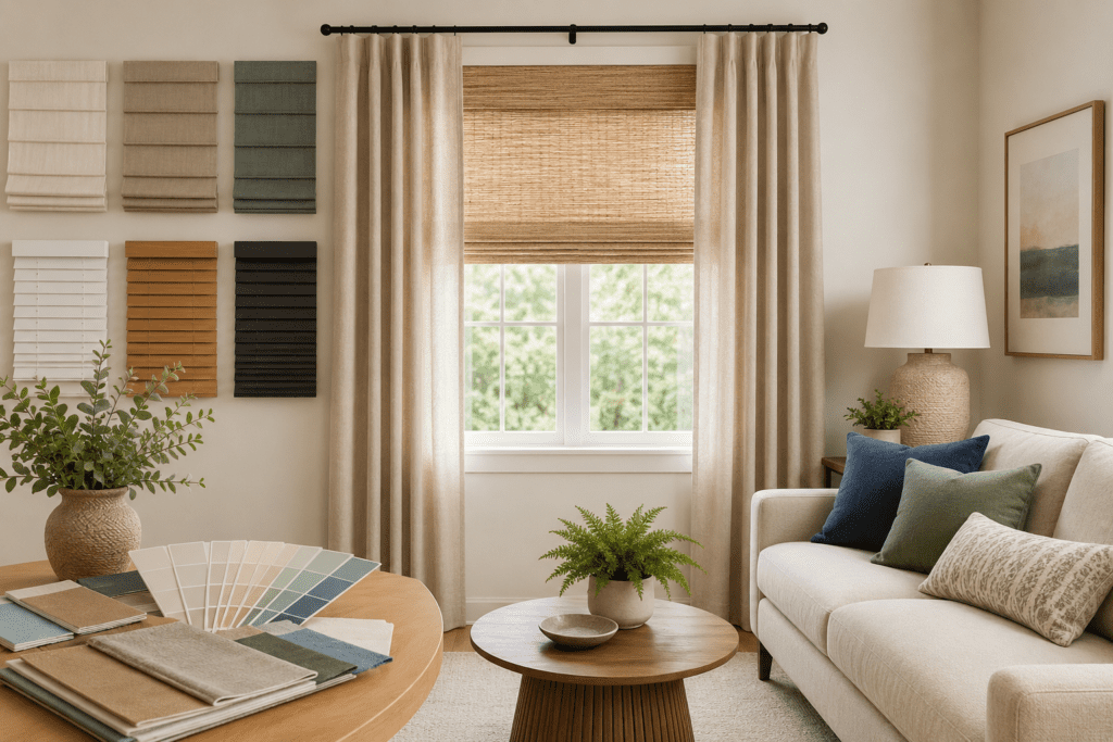
Does Material Affect How a Color Looks?
Yes. The same color can look noticeably different depending on the material it is applied to, so always review samples on the actual product.
- Wood shutters add natural warmth
- Composite shutters provide crisp, consistent color
- Fabric drapery creates softness
- Roller shades offer a clean, flat appearance
What Color Selection Mistakes Should You Avoid?
The most common mistakes are easy to prevent once you know them:
- Choosing colors based only on small samples
- Ignoring lighting conditions
- Following short-term trends
- Failing to plan for future décor changes
- Selecting colors that clash with the flooring or furniture
Evaluating the entire room, rather than a swatch in isolation, helps avoid costly regrets.
Can a Professional Help Choose Window Treatment Colors?
Yes. When you are weighing dozens of options, professional guidance makes the decision easier and more confident. Designers can assess room lighting, existing décor, architectural style, color balance, and long-term design goals.
Working with Carolina Shutter & Blinds provides expert guidance and product samples to simplify the entire selection process.
Conclusion
Choosing window treatment colors is about more than preference. The right colors create balance, enhance natural light, support your design style, and improve comfort. Whether you lean toward timeless neutrals or bold statement shades, a thoughtful approach keeps your window treatments looking beautiful for years.
If you are ready to explore colors that suit your home, the team at Carolina Shutter & Blinds can provide professional design guidance and customized solutions. Contact us today to schedule a consultation and get recommendations tailored to your space.
Frequently Asked Questions
What color window treatments are most popular?
White, off-white, beige, soft gray, and light taupe remain the most popular because they work with a wide range of interior styles.
Should window treatments match wall colors?
Not necessarily. They can match for a seamless look or contrast to create visual interest and depth.
Do darker window treatment colors make rooms feel smaller?
Dark colors make a stronger statement, but used correctly, they add sophistication without necessarily making a room feel smaller.
How does sunlight affect window treatment colors?
Natural light significantly alters how colors appear throughout the day, so always evaluate samples under different lighting conditions before deciding.
Can professional designers help choose window treatment colors?
Yes. Professional guidance helps you select colors that complement your décor, lighting, and long-term design goals.